12.3月14日 数据分析三剑客的使用—matplotlib-各种图
柱状图
案例:
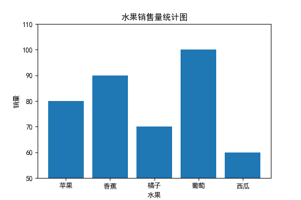
利用柱状图,画各个水果的销售数据
fruits = ["苹果", "香蕉", "橘子", "葡萄", "西瓜"]
sales = [80, 90, 70, 100, 60]
import matplotlib.pyplot as plt
import numpy as np
plt.rcParams["font.family"] = "SimHei"
plt.rcParams['axes.unicode_minus']=False

fruits = ["苹果", "香蕉", "橘子", "葡萄", "西瓜"]
sales = [80, 90, 70, 100, 60]

fig = plt.figure(figsize=(6, 4))
ax = fig.add_subplot()

ax.set_title("水果销售量统计图")
ax.set_ylim(50, 110)
ax.set_xlabel("水果")
ax.set_ylabel("销量")

ax.bar(fruits, sales)

# 显示图形
plt.show()
1. 网格线
ax.grid(True)
代码如下:

可以看出有问题,网格线在柱状图之上了
ax.set_axisbelow(True)
修改后结果如下:
import matplotlib.pyplot as plt
import numpy as np
plt.rcParams["font.family"] = "SimHei"
plt.rcParams['axes.unicode_minus']=False

fruits = ["苹果", "香蕉", "橘子", "葡萄", "西瓜"]
sales = [80, 90, 70, 100, 60]

fig = plt.figure(figsize=(6, 4))
ax = fig.add_subplot()

ax.set_title("水果销售量统计图")
ax.set_ylim(50, 110)
ax.set_xlabel("水果")
ax.set_ylabel("销量")
ax.grid(True)
ax.bar(fruits, sales)
ax.set_axisbelow(True)

plt.show()

2. 添加数据标注
# 添加数据标注
for i in range(len(fruits)):
    ax.annotate(str(sales[i]), (fruits[i], sales[i]), xytext=(0, 10), textcoords="offset points", ha="center", va="bottom")

题目:
利用柱状图画销售数据,要求每周一张图表,保存名字为“第X周图表.jpg”
数据:
fruits = ["苹果", "香蕉", "橘子", "葡萄", "西瓜"]
sales = [[80, 90, 70, 100, 60],[88, 92, 65, 35, 43],[18, 74, 59, 62, 34],[45, 78, 74, 98, 85]]
饼图
import matplotlib.pyplot as plt
import numpy as np
plt.rcParams["font.family"] = "SimHei"
plt.rcParams['axes.unicode_minus']=False
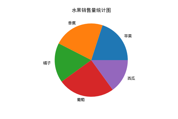
fruits = ["苹果", "香蕉", "橘子", "葡萄", "西瓜"]
sales = [80, 90, 70, 100, 60]
fig = plt.figure(figsize=(6, 4))
ax = fig.add_subplot()
ax.set_title("水果销售量统计图")
ax.pie( sales,labels=fruits)
plt.show()
1. 自定义颜色
import matplotlib.pyplot as plt
import numpy as np
plt.rcParams["font.family"] = "SimHei"
plt.rcParams['axes.unicode_minus']=False
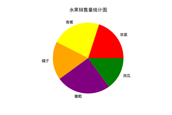
fruits = ["苹果", "香蕉", "橘子", "葡萄", "西瓜"]
sales = [80, 90, 70, 100, 60]
fig = plt.figure(figsize=(6, 4))
ax = fig.add_subplot()
ax.set_title("水果销售量统计图")
custom_colors = ['red', 'yellow', 'orange', 'purple', 'green']
ax.pie(sales, labels=fruits, colors=custom_colors)
plt.show()
https://zhuanlan.zhihu.com/p/622895464
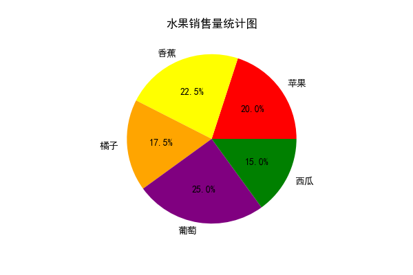
2.显示百分比标签
可以使用 autopct 参数来设置饼图中每个扇形的百分比标签。例如,可以将百分比标签保留两位小数:
ax.pie(sales, labels=fruits, colors=custom_colors,autopct='%1.1f%%')
本文是原创文章,采用 CC BY-NC-ND 4.0 协议,完整转载请注明来自 现代职校董良

评论
匿名评论
隐私政策
你无需删除空行,直接评论以获取最佳展示效果